Ward refurbishment
This article was first published in the Planquadrat, ed. 2/18
The AUF DER BULT hospital is a special hospital for children and young people treating over 40,000 patients per year. It was built in the 1970s on the site of a former racetrack in Hanover, Germany.
The Hanover-based architectural practice Lohr | Architektur GmbH was entrusted with the contemporary renovation and associated modification. The company paved the way for the current modification measures with a target plan drawn up in 2009. The first of three construction phases was completed in 2017 with the opening of the renovated bed block.
The existing hospital was completely gutted for refurbishment after wards had been moved to the dedicated, temporary alternative building which will remain available for additional refurbishment measures and subsequent flexible use. A profitability analysis ruled out the option of a new building – for reasons of costs, but also because the unique location of the hospital offers a view of the surrounding nature reserve from each room. Architects and hospital operators were both keen to preserve this particular quality.
The new ward concept had been developed by architects and employees as part of a participatory process. Everyone involved had been a part of the process, both in terms of planning the functions and design of the building. Employee events and feedback sessions were held to discuss color designs. Consequently, the staff strongly identify with the design of their new workplace after many hours of coordination.
"The color concept supports the intuitive understanding of the organization of the building and the architecture within the station. It combines with the distinctive elements of the interior architecture, like the control center, to create a means for easy communication and orientation with a high recognition value. The high degree of changeability in the color moods on every level means that the design of the bed block provides a good basis for a superordinate orientation system and future construction measures in other functional areas."
Katja Lohr-Tiltmann, Architect, Lohr | Architektur GmbH, Hanover
Lighting concept in synch with biorhythm – artificial light with daylight characteristics
In addition to refurbishing the building, the aim was to reorganize wards and upgrade patient facilities. On each of the hospital's three levels the formerly three wards were merged to one operative unit. For this reason, a roof was built over the yard to accommodate the new central operations center. By integrating the old balconies into patient rooms, it was possible to gain more floor space to easily provide facilities for persons accompanying patients. A multifunctional day room is also used as a therapy facility or additional patient room.
Architects consulted Studio DL light planning studio from Hildesheim to guarantee adequate lighting in the large rooms. Thanks to a unique lighting concept, nominated for the German Light Design Award 2018, the control system of the artificial lighting is modeled on daylight as part of Human Centric Lighting to imitate the human day and night rhythm. Patients are invigorated in the mornings and calmed down in the evenings by changing the light color and intensity.
Examination lighting and an orientation light that has been adapted to the light color guarantee functionality and safety at any time of day or night. Staff facilities have also been taken into account in the lighting concept: Thanks to day and night scenarios, daylight control particularly comes into its own at night to boost care staff's willingness to perform. Long hallways have been integrated into the lighting control thanks to a lighting strip. In this context, the circular ceiling light elements can be calibrated with different patterns at the control center.
Color dynamics and grid points – color concept for small and grown children
AUF DER BULT hospital turns being ill and hospitals into a positive experience on the basis of the Kunterbult world of learning and experiencing, geared towards the needs of children. This also includes a world of animals that was used to coordinate the color selection on different floors. After having specified these, architects consulted experts from Color Concept Lab, such as DL Studio lighting planners, to develop the lighting concept, as light, color, space and material had to be closely coordinated.
Color profiles were developed for each ward on the basis of a color master plan to develop a pixel-type dot grid and supplement the color concept by graphic components. The long hallways are visually cut by dynamically staggering the color nuances of impact protection and hallway walls and making them gradually more intensive towards the far end. Dotted designs as the highlights around the common room form an opposite visual effect as the functional center of each wing.
Hallways' expressive color design lends an identity and is met by the calm, homely character of patient rooms. In contrast to the intense colorfulness of the hallways, rooms take a step back and feature the same design on all levels. Merely the colored dot in the floor covering indicates the ward's color. Walls and flooring also feature neutral colors so that medical staff are not disturbed when they treat patients. Curtains and washrooms once again feature elements that set subtle color highlights as part of cascading colors.
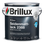
"We used 2K Aqua Silk Matt Enamel 2388 for the first time in the bed block. I was particularly impressed by the easy application, the adhesion properties and, above all, the robustness. In percentage terms, we had to touch up fewer coats than would usually be the case on a construction site. The quick drying and paint-over ability are further advantages. This means that a painted surface can be masked off much earlier, for example, which can make a massive difference in the final phases of a construction site in particular."
Jens Rönick, Malerbetrieb Bosold, Küllstedt
Resilient surfaces – high-tech paint for doors
Each hospital poses very stringent requirements to the surface coating in terms of cleaning and disinfection agents. This particularly affects surfaces that are also subject to severe mechanical stress in addition to chemical substances. Constant contact with sweaty hands on the handrails in ward hallways, aggressive cleaning agents and short cleaning intervals, patient beds hitting doors and door frames – intensively used hospital areas must feature extremely resistant coatings.
For this reason, one of the most recent product developments devised by the Brillux research and development center was used to refurbish the hospital and coat the 300 frames, fireproof doors and handrails in staircases: 2K-Aqua Silk Matt Enamel 2388. Immersion-primed frames were coated twice with 2K-Aqua Silk Matt Enamel 2388, as were powder-primed, fireproof doors and handrails.
Water-based, polyurethane acrylic enamel merges two components to form a new high-tech coating. Thanks to a link between developing surfaces, they are very resistant to mechanical and chemical stress, abrasion-resistant and resistant to scratches. 2K-Aqua Silk Matt Enamel 2388 has been tested by the German Committee for Health-Related Evaluation of Building Products (Ausschuss zur gesundheitlichen Bewertung von Bauprodukten, AgBB). It emits only a faint odor and is highly resistant to disinfection agents, sweat, creams and grease. The coating is also resistant to light and weather conditions, can be decontaminated and is suitable for indirect contact with foodstuffs.
Preventing grazing light and writing effect – high-performance coatings for walls
Comprehensive samples were necessary before it was possible to finalize the color concept which had already been defined in the specifications of the project. HCL control on the basis of daylight required the color effect to be verified as part of different day and night scenarios. For this purpose, some areas were fitted in advance before color ranges were applied to coated partial areas for sampling. This resulted in the requirement of having to adapt coatings' previously selected pigmenting.
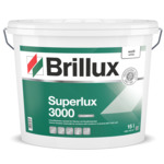
The coatings in hallways and on room walls were subject to stringent demands: Here Brillux Superlux ELF 3000 interior emulsion was used to provide an ideal solution for large areas subject to problematic lighting conditions, such as long hallways or in front of large windows. Consequently, it was possible to master the challenging grazing light under lighting paneling in hallways. Thanks to the high hiding power of Superlux ELF 3000 (class 1 at 7 m²/l) and class 2 wet abrasion resistance, untextured wall surfaces were implemented in a dull matt gloss grade.
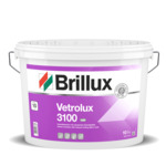
For the intensive color shades on the walls in hallways Brillux's Technical Consultant Stephan Quarg relied on the guaranteed pigment protection of Vetrolux ELF 3100. This matt interior emulsion features highly transparent functional filler material. It additionally protects pigments from damage. Any potentially occurring writing effect marks on the surface can be largely removed without a polishing effect.


